
Sometimes, refreshment or an upgrade fits nicely. But if changes are too big, the effect could be counterproductive.
People need time to adapt to big changes, just as new neural links need to be built and connected in our brains. Because of that, people use more energy than usual. And that’s one of the contributing factors that drive people away from such applications, websites, and other types of publications.
Figure 1: The change between the first and the second logo is big. The other transitions are appropriately subtle.
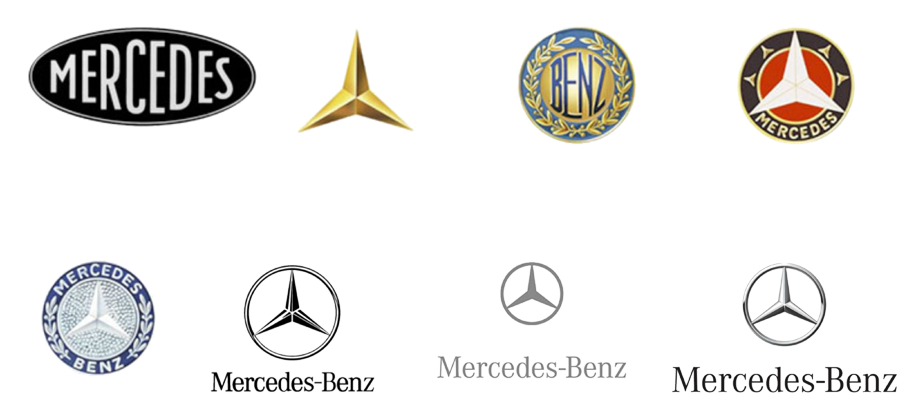
Figure 2: There is no visual relation between the first three logos (left to right). The relations between the last five logos are good.
A case from Google Maps: For twelve years, people have been used to seeing a vivid and contrasting orange line representing the motorways on the map. But suddenly, in July 2016, a notable decrease of contrast appeared on the map.
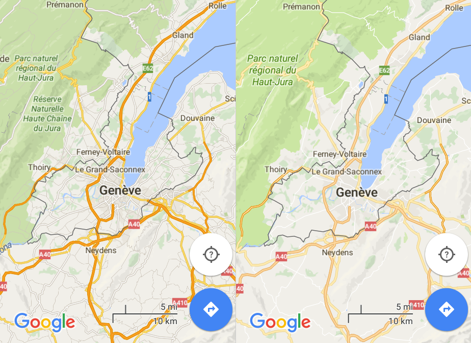
Figure 3: On the left is a more vivid appearance of streets and motorways, used for 12 years. Then suddenly they lost the contrast (right).
If there was already a decision to decrease the contrast of particular map elements, it should have been done gradually and in small steps, like decreasing the contrast a bit every couple of months.
If your product or a service is good yet you still desire some change, it’s wise to consider if the change’s steps are small enough and if the duration intervals are long enough in order for people to adapt to the final version.