
Let’s face it. In 2016, there should be no more blurry content on screens. Content should be appropriately sharp. We as internet users were used to blurry and pixelated images and text in 1998, but today?
When the majority of graphic elements on a website are sharp, the blurry ones stand out and give a perception of low quality.
A case from www.audi.se: “Audi unite” and the text below appears to be fuzzy and blurry. Not only is the white text blurry but the background photo with the “pixelated” red lines is as well. The difference in sharpness appears to be even bigger in this case, as the other text is from Windows OS, which traditionally has a crispier and thinner type of text rendering (in comparison to Mac and Ubuntu OS, for example).
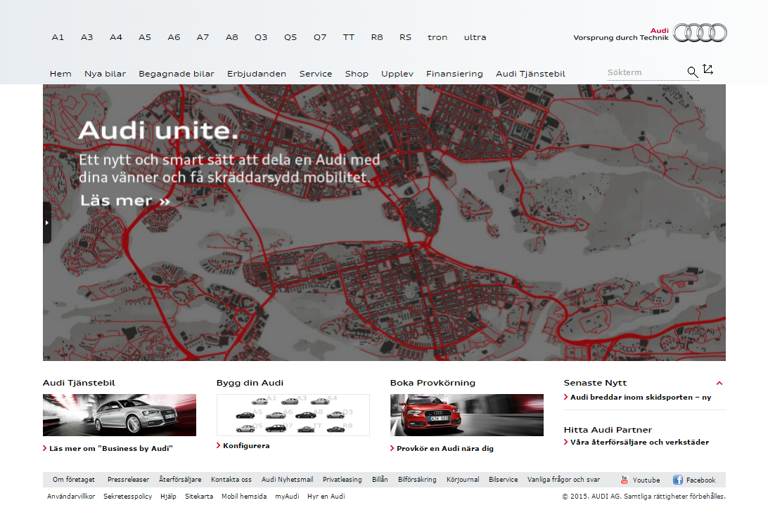
Figure 1: www.audi.se with fuzzy and blurry elements in the main banner.
A case from www.volkswagen.de: The text at the bottom of the banner (Kraftstoffverbrauch) appears to be blurry in comparison to other text on the webpage.
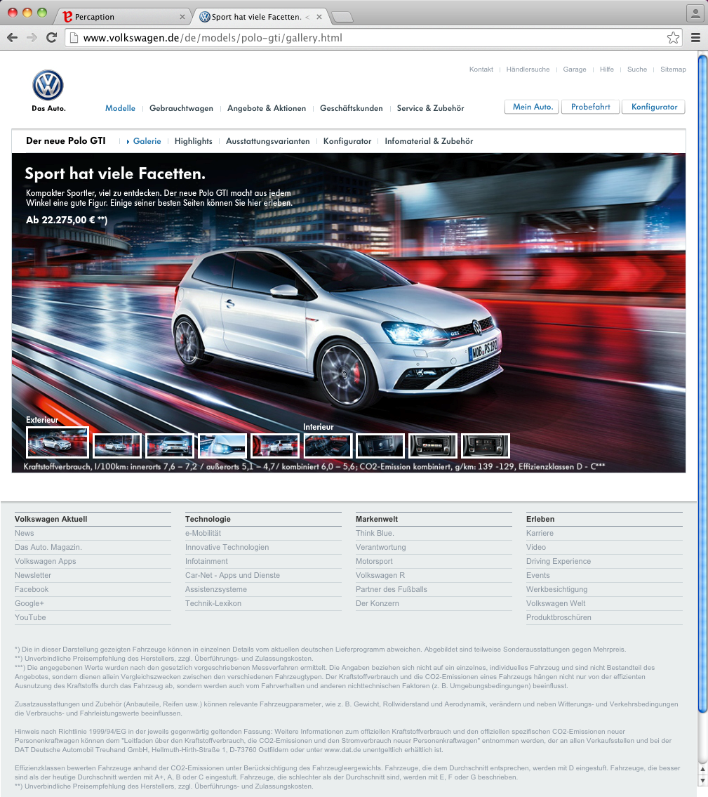
Figure 2: Volkwagen.de website rendering from Google Chrome under Mac OS.
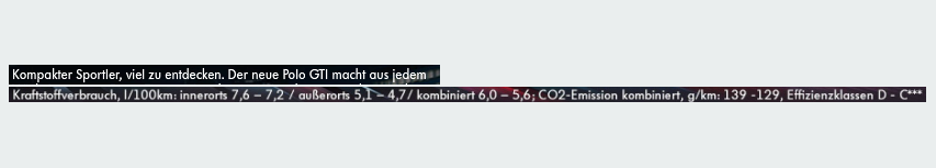
Figure 3: Sharpness comparison.
Decent brands should have decent perception. Contact Percaption, we can keep an eye also on your website.